CMYK vs RGB: Which Color Mode Actually Matters for Print?
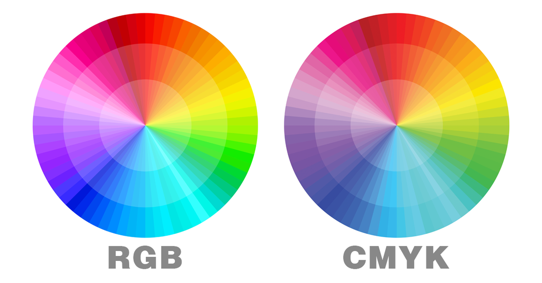
RGB vs. CMYK
Some colors undergo significant changes when converted to CMYK. The examples below show which colors shift the most. Try to avoid these colors when designing for printing, whenever possible. If you need to use them, adjust any important colors in CMYK mode for the best results before finalizing your design.
RGB – Used for screen displays (what you see on your computer or device)
CMYK – Used for printing (how colors will appear when printed)

Let's dive in...
CMYK or RGB color modes confuse even experienced designers when it comes to print projects. Ever sent a design to print only to receive results with dull, shifted colors that look nothing like your vibrant digital version? This frustrating experience often stems from a single mistake: using the wrong color mode.
While RGB creates stunning visuals on screens through light, CMYK works differently by using ink combinations for physical printing. Understanding this fundamental difference is crucial for professional print results. When you prepare designs in RGB but print in CMYK, color shifts are inevitable, sometimes dramatically altering your carefully selected palette.
The CMYK vs RGB decision significantly impacts printing quality and accuracy. RGB offers a wider color range but can't be fully reproduced with printer inks. CMYK, though more limited in range, delivers predictable, consistent results on paper, business cards, brochures, and other printed materials.
In this comprehensive guide, we'll break down exactly when to use each color mode, how to convert between them properly, which file formats work best, and practical techniques to ensure your prints match your design vision. By the end, you'll confidently navigate color modes to achieve professional print results every time.
RGB vs CMYK: Core Differences Explained
Understanding the fundamental differences between color modes is essential for achieving accurate color reproduction. The technical distinctions between RGB and CMYK directly impact how your designs appear across different media.

Color Models: Additive (RGB) vs Subtractive (CMYK)
RGB and CMYK represent two entirely different approaches to color creation. RGB operates on an additive color process, starting with darkness (absence of light) and adding colored light to create various hues. When red, green, and blue light combine at full intensity, they produce white.
In contrast, CMYK employs a subtractive color process, beginning with white paper and removing light wavelengths through ink application. As cyan, magenta, yellow, and black inks layer on paper, they absorb (or subtract) specific wavelengths of light. Consequently, more ink results in darker colors, eventually approaching black.
Think of these models as opposite approaches:
- In RGB: Black (no light) + Light = Colors
- In CMYK: White (paper) - Ink = Colors
The "K" in CMYK stands for "key" rather than simply representing black. Historically, in traditional print color separation, the key plate held the most detail and other colors aligned with it. Furthermore, despite theoretically being able to create black by combining cyan, magenta, and yellow, the result tends to be a muddy brown, hence the addition of a separate black ink for true depth.
Color Gamut: Wider in RGB, Limited in CMYK
Perhaps the most noticeable difference between these color models is their respective color ranges. RGB creates an impressive 16.7 million possible color combinations, notably surpassing CMYK's more limited 16,000 possibilities. This explains why certain vibrant colors seen on screen cannot be precisely reproduced in print.
This disparity occurs because screens emit light directly, allowing for bright, saturated colors that ink on paper simply cannot match. Digital displays can produce neon and highly saturated colors that fall outside the CMYK gamut (printable range). Additionally, any colors existing outside this gamut will trigger warnings in design software, indicating they may not print accurately.
During conversion from RGB to CMYK, many designers notice their once-vibrant designs appearing duller or muted. This isn't a flaw, it's an inherent limitation of the printing process that must be accounted for during design.
Output Medium: Screens vs Physical Prints
The intended display medium essentially dictates which color mode to use:
RGB dominates the digital world because it mirrors how our eyes perceive color. Our retinas contain receptors for red, green, and blue light, making RGB ideal for:
- Computer monitors and screens
- Digital photography
- Websites and mobile applications
- Television and video content
CMYK excels in print applications because it reflects how inks interact with paper. It's the standard for:
- Business cards and brochures
- Magazines and newspapers
- Posters and flyers
- Product packaging and labels
The technical specifications differ as well. RGB colors use values ranging from 0 to 255 for each channel, whereas CMYK uses percentage values for each ink color. For instance, a vibrant blue might be R:0, G:100, B:255 in RGB, but C:100%, M:30%, Y:0%, K:0% in CMYK.
Attempting to use RGB files for print projects inevitably leads to color shifts during conversion. Therefore, designing in the appropriate color mode from the start ensures more predictable, consistent results across your chosen medium.
When to Use RGB or CMYK in Design Projects
Choosing the right color mode is a critical decision that directly affects your project's final appearance. Let's explore exactly which color mode to use for specific design scenarios.
RGB for Digital: Websites, Social Media, Apps
RGB dominates the digital design landscape for good reason. Since screens create colors by emitting light, the RGB model perfectly aligns with how digital displays function. RGB creates an impressive 16.7 million possible color combinations, making it ideal for vibrant digital visuals.
Use RGB color mode for:
- Web and app design elements (buttons, icons, graphics)
- Online branding materials (logos, banners, ads)
- Social media content (profile pictures, post images, stories)
- Digital photography and visual content
- Video graphics and motion design
- Infographics and data visualizations
Starting with RGB for digital projects ensures your colors appear exactly as intended across screens. Since RGB uses an additive color process, it can produce exceptionally bright, saturated colors that simply aren't achievable in print. For instance, those eye-catching neon colors and vibrant blues seen on websites would appear noticeably duller if converted to CMYK.
CMYK for Print: Business Cards, Posters, Banners
Whenever your design will be physically printed using ink, CMYK becomes essential. Unlike digital displays, print materials reflect light rather than emit it, necessitating a completely different approach to color.
Apply CMYK color mode for:
- Marketing collateral (business cards, brochures, flyers, postcards)
- Large format printing (posters, billboards, banners, yard signs)
- Product packaging and labels
- Branded merchandise (t-shirts, hats, promotional items)
- Restaurant menus and stationery
- Magazine and newspaper advertisements
Starting your print projects in CMYK eliminates the unpleasant surprise of color shifts during printing. Although CMYK offers a narrower color gamut than RGB, it provides greater control over how your designs will appear on physical media. Consider this practical example: a vibrant fluorescent green in RGB might print as a much duller olive green in CMYK. By designing in CMYK from the beginning, you'll see realistic color representations throughout your workflow.
Mixed Media Projects: Choosing a Primary Mode
Many modern projects exist in both digital and print environments, creating a color mode dilemma. For these mixed-media situations, consider your primary distribution channel first.
If your design will primarily live online with occasional print needs:
- Create your master file in RGB to maximize digital visual impact
- Maintain a separate CMYK version for print applications
- Adjust problematic colors that shift dramatically during conversion
Alternatively, if print is your primary medium with digital as secondary:
- Design primarily in CMYK to ensure print accuracy
- Create an RGB version specifically optimized for digital display
- Consider slightly different color palettes for each version if necessary
Logo design exemplifies this challenge perfectly. Designers often begin creating logos in RGB to ensure they look impressive on websites and social media. Nevertheless, the same logo must work equally well on business cards and signage, requiring thoughtful CMYK conversion. Professional designers frequently maintain separate master files for both scenarios, recognizing that perfect color matching across all media is sometimes physically impossible.
Above all, understanding these color mode requirements early in your design process saves considerable time and prevents frustration when your carefully designed colors don't translate as expected.
File Formats and Color Mode Compatibility
File formats serve as crucial vessels for your color data, directly impacting how accurately your design translates from screen to print. Choosing the wrong format can undermine even perfectly executed color mode selection.
RGB Formats: JPEG, PNG, GIF, SVG
RGB-optimized file formats primarily serve digital environments where light emission creates colors:
JPEG (Joint Photographic Experts Group) excels for photographs and complex images with thousands of colors. Its lossy compression makes it ideal for web use where file size matters. JPEGs balance quality and compression, making them readable almost anywhere online.
PNG (Portable Network Graphics) offers lossless compression with alpha transparency support, perfect for graphics that need crisp edges or transparent backgrounds. PNGs maintain quality without degradation, making them suitable for logos and interface elements that require precision.
GIF (Graphics Interchange Format) supports only 256 colors, making it unsuitable for print but perfect for simple web graphics and animations. This format should generally be avoided for any print-related projects due to its severe color limitations.
SVG (Scalable Vector Graphics) differs fundamentally as a vector format rather than raster. SVGs store mathematical equations instead of pixels, allowing infinite scaling without quality loss – ideal for logos and icons across multiple sizes and applications.
CMYK Formats: PDF, TIFF, EPS, AI
Print-oriented formats accommodate the CMYK workflow essential for physical reproduction:
PDF (Portable Document Format) stands as the universal standard for print-ready files. PDFs preserve layout, fonts, and color information across platforms while supporting both vector and raster elements. When uncertain which format to use for printing, PDF typically provides the safest option.
TIFF (Tagged Image File Format) delivers lossless, high-resolution image quality crucial for professional printing. TIFFs maintain every detail without compression artifacts, making them ideal for capturing intricate details in photographs or illustrations.
EPS (Encapsulated PostScript) specializes in vector graphics like logos and illustrations. Originally developed by Adobe, EPS files maintain scalability without quality loss – crucial for large-format printing applications.
AI (Adobe Illustrator) serves as the industry standard source file for CMYK vector graphics. This native format preserves full editability while maintaining precise color specifications needed for print projects.
Why File Format Matters for Color Accuracy
File format selection directly impacts color fidelity throughout your workflow. Incorrect format choices can result in unexpected color shifts, loss of detail, or even printing errors.
Format compatibility with color modes ensures your carefully selected palette remains consistent from design to output. For instance, attempting to use RGB-optimized GIFs for print projects inevitably results in color degradation and limited reproduction options.
Professional printers typically require specific formats that preserve color information accurately. Before finalizing any print project, consulting with your printer about preferred file formats can prevent costly mistakes and reprints.
Remember that converting between formats sometimes introduces subtle color shifts, particularly when moving between RGB and CMYK color spaces. Starting with the appropriate format for your intended output medium helps maintain color integrity throughout your workflow.
How to Convert RGB to CMYK Without Losing Quality
Converting between RGB and CMYK requires careful attention to preserve your design's visual integrity. Professional conversion techniques help minimize the inevitable color shifts that occur during this process.
Photoshop: Image > Mode > CMYK
Converting RGB images to CMYK in Photoshop follows a straightforward path, yet using the right method matters significantly:
- Open your RGB image in Photoshop
- Navigate to Image > Mode > CMYK Color
- When prompted about flattening layers, select "Flatten" to maintain color consistency
- Save your image using File > Save As and select an appropriate format (TIFF or PDF recommended)
For greater control over conversion quality, use Edit > Convert to Profile instead of the basic mode change. This advanced option lets you select specific rendering intents and color profiles that match your printing conditions.
Illustrator: File > Document Color Mode
Converting in Illustrator maintains vector quality while transforming colors:
- Open your document in Illustrator
- Go to File > Document Color Mode > CMYK Color
- Subsequently, select all objects (Ctrl+A or Cmd+A)
- Choose Edit > Edit Colors > Convert to CMYK to ensure all elements convert properly
Afterward, fine-tune your colors using the Color panel. Double-click fill boxes to adjust individual colors, paying close attention to warning indicators that suggest nearest available CMYK alternatives.
Proofing Colors Before Final Export
Soft proofing helps visualize how colors will look when printed:
- In Photoshop, select View > Proof Setup > Custom
- Choose the appropriate CMYK profile for your printing conditions
- Enable View > Proof Colors to toggle between RGB display and CMYK simulation
Meanwhile, Illustrator offers View > Overprint Preview to show how colors will mix during printing. This preview identifies potential issues prior to committing to final output.
Common Color Shifts and How to Fix Them
Vibrant blues typically shift most dramatically during conversion. Blues containing high RGB values often appear dull in CMYK. Primarily adjust these by:
- Using Selective Color adjustment layers targeting specific color ranges
- Setting the Absolute radio button in Selective Color panels
- Reducing "contaminating" colors (usually yellow and black) that muddy blues
For overall color vibrancy issues, Hue/Saturation adjustment layers help recover some lost saturation without affecting contrast. Moreover, maintaining a duplicate of your original RGB file ensures you can always return to make additional adjustments should printed results disappoint.
Best Practices for Print-Ready Color Accuracy
Achieving print-ready color accuracy demands more than just selecting the right color mode. Professional printers rely on specific practices to ensure what appears on screen faithfully transfers to paper.
Start in CMYK for Print Projects
Designing directly in CMYK color mode straightaway eliminates unexpected color shifts that occur during conversion. Files should be submitted in CMYK color profile at 300DPI for optimal printing results. Initially creating in RGB and later converting to CMYK often leads to disappointing outcomes, especially with vibrant colors. Starting with the end medium in mind ensures your color choices remain within printable limits.
Use Calibrated Monitors and Swatch Books
Monitor calibration forms the foundation of color accuracy. Uncalibrated displays show colors differently than they'll actually print. Professional calibration requires:
- A hardware colorimeter device
- Consistent ambient lighting (ideally 100-120 cd/m² brightness)
- Gamma setting of 2.2 and D65 (6500K) white point
Paper swatchbooks likewise serve as invaluable physical references. These samples demonstrate how colors actually render on different papers, helping designers compare offerings between paper mills. Swatchbooks show formation quality, shade consistency, and color reproduction capabilities across various weights and finishes.
Order Samples to Check Final Output
Ordering proofs or sample prints constitutes an essential step before committing to full production runs. This practice catches potential problems early and prevents costly reprints. Samples confirm that colors, layout, and details appear as intended, considering that different printing methods and substrates affect final appearance.
Avoid Soft Gradients and Use Solid Colors
Gradients frequently cause headaches in print production through visible banding effects. This occurs because CMYK profiles aren't perfectly linear, unlike RGB color spaces. For smoother printing results:
- Use 16-bit color mode instead of 8-bit when creating gradients
- Consider working in RGB color space first if gradients are essential
- Limit gradients to only 2-3 different colors
- Opt for solid colors whenever possible
Conclusion
Understanding color modes stands as the critical foundation for successful design projects that transition between digital and print worlds. RGB creates stunning digital visuals through light emission, offering 16.7 million vibrant color possibilities perfect for websites, apps, and social media. CMYK, however, provides the necessary framework for physical printing through ink combinations, despite its more limited 16,000 color range.
This fundamental difference explains why designs often appear duller when printed than they do on screen. Many designers experience this frustration simply because they worked in the wrong color mode from the beginning. The choice between CMYK and RGB significantly impacts final results, particularly when color accuracy matters.
File format selection also plays a crucial role in maintaining color integrity. JPEGs, PNGs, and SVGs excel for RGB digital applications, while PDFs, TIFFs, and EPS files preserve CMYK data needed for professional printing. Mismatching your format with your intended output medium almost certainly guarantees disappointing results.
Professional designers follow specific best practices to ensure color accuracy. They start projects in the appropriate color mode based on the primary output medium, use calibrated monitors alongside physical swatch books, order proof samples before full production runs, and generally avoid soft gradients in favor of solid colors.
The most important takeaway remains clear: match your color mode to your final medium from the project's beginning. This single decision dramatically improves your chances of achieving professional-quality results whether your work appears on screens or in print. Armed with this knowledge about RGB and CMYK color modes, you can confidently create designs that maintain their visual integrity across all platforms.